
On New Jersey's Opioid Problem
I was raised in New Jersey and (at this point, like many people) have friends and family impacted by opioid addiction. I’ve read news reports on the prescription opioid epidemic, but I’ve never done a deep dive into the data behind the epidemic until now.
The Automation of Reports and Consolidated Orders System (ARCOS) database tracks the supply side of opioid pills in the United States, with data on every prescription opioid pill sold from a manufacturer to a pharmacy from 2006 to 2014. The data from ARCOS is owned by the Drug Enforcement Agency (DEA), but was released by the Washington Post on July 16th, 2019, after a long legal battle in conjunction with the Charleston Gazette-Mail of West Virginia.
Using ARCOS, as well as a variety of other datasets, I found that an increase in the number of pills supplied per capita to a county in New Jersey is associated with more prescription opioid related hospitalizations. The CDC’s latest guidelines for prescribing opioids for chronic pain found that “no evidence shows a long-term benefit of opioids in pain and function versus no opioids for chronic pain with outcomes examined at least 1 year later (with most placebo-controlled randomized trials ≤6 weeks in duration)”. Given these guidelines, it is difficult to justify the amount of opioid pills being supplied to New Jersey counties over the years of ARCOS data available.
The opioid epidemic is far reaching, and the ARCOS database is an invaluable resource for understanding it. For national coverage and analysis of ARCOS, check out the Washington Post’s collection of articles. For local reports on ARCOS, check out the Washington Post’s other collection of articles. For an existing analysis of this data for New Jersey, I recommend NJ.com’s article, which is filled with excellent data visualizations and reporting, summarizing the impact of the flood of prescription pills into New Jersey’s communities.
All code and data for the analyses from this post can be found at the associated github repository.
About the Data
Hospitalizations
NJ.gov has a data dashboard on drug-related hospital visits from 2008 to 20181, which has enough overlap with the years of ARCOS data to be usable. It is also one of the few public health outcomes I could find with full data, as many counts (like opioid related mortality) are suppressed for privacy reasons.
Although it is a rough estimate of trend, every county in New Jersey has a positive correlation between year and number of prescription opioid related hospitalizations. We can at least be sure that over the time period of the data, prescription opioid related hospitalizations are not decreasing.
ARCOS
The ARCOS API wrapper in R has a handy arcos::summarized_county_annual() function that pulls in the number of hydrocodone and oxycodone pills supplied to a county per year. Going forward, when I refer to opioid pills in the context of the ARCOS dataset, I only mean oxycodone and hydrocodone pills.
The years of hospitalization data span from 2008 to 2015, while the ARCOS data goes from 2006 to 2014. This presented an issue when combining data for any analysis. If I simply took the number of county-year observations from the overlap of these two datasets, there would only be 147 observations for the 21 counties in New Jersey, a lot less data than the full 9 years of ARCOS data. So partially motivated by trying to maximize the number of observations, and partially because there could legitimately be a lag in the effect of opiate pill supply (dependence on a substance that could lead to an eventual hospitalization takes some nonzero amount of time to develop), I lagged the ARCOS data by one year to match up with the hospitalization data. Despite that change, I still lose the 2006 year of ARCOS data, bringing us to 168 observations, 21 counties and 8 years of data, from 2008 to 2015. In the future, I would like to more rigorously examine my assumption of a lag.
From 2006 to 2014, New Jersey was supplied with 1,976,570,050 hydrocodone and oxycodone pills. On average, 24.97 hydrocodone and oxycodone pills were supplied per capita per year (per capita rates are obtained with county population estimates from the American Community Survey, discussed in greater detail below).
There is quite a bit of range in the supply profile of counties, from Hudson County with 15.32 pills per capita supplied on average to Gloucester County with 43.64 pills per capita supplied on average. However, common across all counties, is an upward trend in the number of pills per capita supplied over time.
Indeed, every single county in New Jersey has a positive correlation between opioid pills supplied per capita and year. A visual inspection of the relationship between pills supplied and hospital visits shows a generally positive association between the two quantities.
Prescriptions
Data for opioid prescription rates by county (the number of prescriptions per 100 people) can be found on the Center for Disease Control’s (CDC) prescription rate maps.2 For the eventual model of hospitalizations, prescription rate data is also lagged by one year to match up with the ARCOS data.
Interestingly, although the supply to pharmacies of hydrocodone and oxycodone pills is increasing, the prescription rates do not always show the same obvious positive trend.
Prescription rates, however, do seem to have a positive relationship with the number of prescription opioid-related hospital visits. The one group of visual outliers from this trend is Cape May. Out of all the counties, Cape May has the highest percentage of its population aged 60 years or older. It has an unusually high proportion of an age demographic that is more likely to get a prescription, but is less likely to be hospitalized for prescription opioid abuse (although the elderly can certainly abuse prescription opioids in a way that leads to hospitalization).
Controlling Variables
To model the effect of the number of opioid pills supplied as accurately as possible, I need to control for the other mechanisms that might impact the number of prescription opioid related hospitalizations. To best approximate these other factors, I pulled down demographic and economic characteristics of each county, so at least I can control for the changes in a county’s “environment” (i.e. the make-up of its residents and its economic health).
For all demographic (and some economic) characteristics, I used the U.S. Census’s American Community Survey (ACS) 1 year estimates, pulled down with the tidycensus package. The ACS is continually sampled throughout its defined duration, with the 1 year ACS estimates having the smallest sample size of the available ACS datasets (the others being the 3 and 5 year). However, since we are interested in individual years and changes between those years, the 1 year estimates are more suited to our data (except for race categories in Cape May county in 2011, which had missing data for its 1 year estimate and was filled in with the 5 year estimate instead).3 I gathered distribution data on race, age, and median household income for each county from 2008 to 2015. Under the recommendation of the U.S. Census, I used the annual averages from the Consumer Price Index research series to translate the median incomes to 2015 U.S. dollars.
Unemployment rates for each county, as another proxy for economic conditions, were pulled from the Bureau of Labor Statistics (BLS) Local Area Unemployment tables.
Random-Intercept Model
I model the impact of the opioid pill supply on New Jersey by trying to find its effect on a negative public health outcome, prescription opioid related hospital visits. My testable hypothesis is: An increase in the number of opioid pills supplied per capita to New Jersey counties is associated with an increased number of prescription opioid related hospital visits. For reasons discussed in the Appendix, I chose to model prescription opioid hospitalizations with a random-intercept model.
The final set of data sources for this model are:
- ARCOS API
- NJ.gov Hospitalization Data Dashboard
- American Community Survey (ACS) 1-year estimates from the
tidycensuspackage - Bureau of Labor Statistics (BLS) Local Area Unemployment tables
- Center for Disease Control’s (CDC) prescription rate maps
Each observation in the final dataset is a year within a county. I want the model to not only measure the yearly effect of a variable (i.e. the effect of prescription rate on hospiatlizations for a county in a given year), but also to estimate “between effects”, differences between the average number of prescription opioid related hospitilizations for a county. To do this, I use the “within-between” formulation of the random-intercept model found in Bell and Jones, 2015, itself a modification of the formula found in Mundlak, 1978. I county-mean center all the variables, so that for example, each year of opioid supply data in Morris County has the mean number of opioid pills supplied per capita for Morris County subtracted from it. I also include the mean of almost every variable discussed to capture “between effects”. For example, the mean number of opioid pills supplied per capita for each county is included as a variable.
County-mean demographic variables are not included for a few reasons. The number of observations in the data is small, and I was having difficulty getting a model to converge on a stable set of estimates, so I wanted to be careful with adding too many variables into the model. After including these variables in the model, the Akaike information criterion (AIC), a common measure of predictive model fit, went up slightly (indicating a worse model fit) and the residual diagnostics (discussed in the Appendix) indicated a worse fit as well.
I use a Poisson distribution (a commonly used distribution to model count data) with a log link and the lme4::glmer function from the lme4 package to estimate the model. In addition to the variables discussed before, indicator variables for each year of data are included to account for any potential differences in the data gathering process from year to year.
Model Results
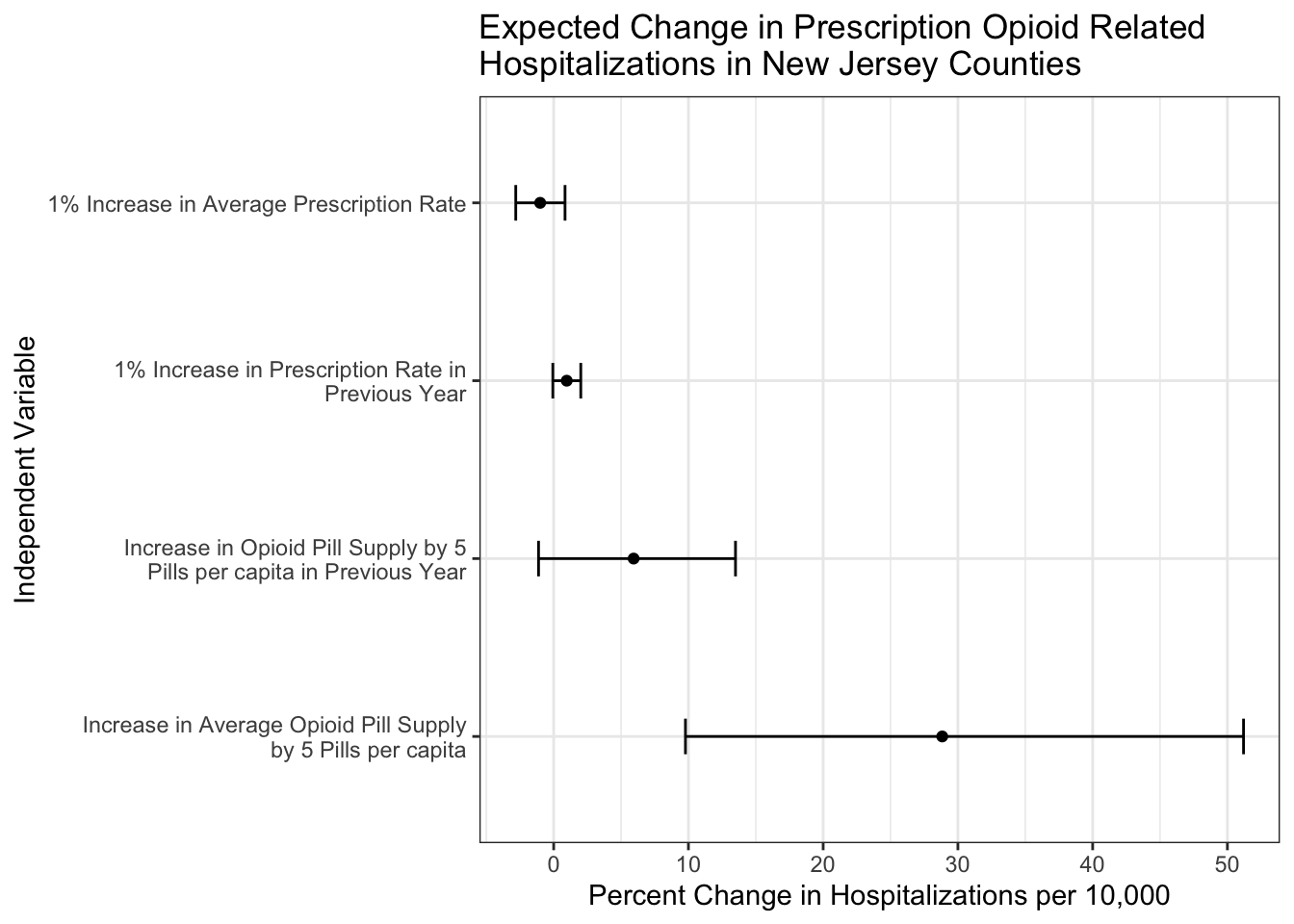
I translated the coefficients of the resulting model to be percent changes in the number of prescription opioid related hospitalizations per 10,000 residents of a county. A coefficient can be interpreted as changing the number of prescription opioid related hospitalizations per 10,000 by x%, controlling for the other variables. For “within effects”, this change is for a county in a year, while for “between effects”, this change is in the average number of hospitalizations for a county. In parentheses are the percent change estimates 2 standard errors below and above the point estimate.
| Poisson Random Intercept Model | |
|---|---|
| Independent Variable | Percent Change in Prescription Opioid Related Hopsitalizations (per 10,000) |
| Between | |
Average Opioids per Capita from 2007-2014 (in 5 pill increments) |
28.84 (9.78, 51.2) |
Average Prescription Rate from 2007-2014 |
-1 (-2.81, 0.84) |
| Within | |
Opioids per Capita in Previous Year (in 5 pill increments) |
5.93 (-1.12, 13.49) |
Prescription Rate in Previous Year |
0.97 (-0.06, 2.01) |
The main takeaway from the estimates is that there is indeed an association between the supply of opioid pills to a county and its prescription opioid hospitalization rate. More specifically, after controlling for the demographic and economic descriptors of a county and its prescription rate, a county in New Jersey with a 5 pills per capita higher average number of prescription opioids supplied can be expected to have 28.84% more prescription opioid related hospitalizations per 10,000 residents.
For further examination of the legitemacy of this model and its results, check out the Model Diagnostics section of the Appendix.
Final Thoughts
Did I create a model that controls for all the institutional effects happening within a county and between counties that could impact its number of prescription opioid hospitalizations? Definitely not! Are there issues with the data I use in this analysis. Sure! ACS 1 year estimates can be imprecise, one can imagine all sorts of difficulties with accurately classifying a hospitalization as related to prescription opioid abuse, and for a complex model there are only 168 observations. This is a first stab at this question, and there will be future work to improve upon this. However, given the available data, I think there is still enough evidence to say that the number of opioids being supplied to counties in New Jersey is strongly related to an increased number of prescription opioid related hospitalizations. Even outside of the model, the raw numbers of opioid pills being supplied to these counties is concerning.
Further analysis and more data is needed to exactly quantify the effect of the opioid pill supply on New Jersey counties, and programs like CDC’s Enhanced State Opioid Overdose Surveillance (ESOOS), of which New Jersey is a part of, could be a potentially rich source of information for these future analyses and models.
Ideally, this analysis could be extended to all counties in the United States. Perhaps a future project!
Appendix
Choosing a model
Every observation in the data is a year in a county, repeated measures that create a nested hierarchy. Hierarchies in data violate a standard assumption of linear regression - after controlling for all included variables in a study, the residuals from each observation are independent. The yearly number of hospital visits within each county will be correlated, and therefore the residuals from a linear regression are also likely to be correlated. We are forced to use some other method besides linear regression or its extensions like the general linear model.
From my research, I found three general approaches to hierarchical data analysis:
- Generalized Estimating Equations (GEE)
- Fixed-Effects Modeling
- Random-Effects Modeling
GEEs have minimal assumptions on the relationship between independent and dependent variables (always nice), but inferences from this model are restricted to your data’s population mean. Although I run a GEE for a robustness check of my results, I ideally wanted to be able to make inferences at the county level (i.e. I’d like to be able to say “I expect a county in New Jersey to have an increase in its prescription-opioid hospitalizations when a variable changes…” over “I expect New Jersey to have an increase in its prescription opioid hospitalizations when a county-level variable changes…” ).
The other two methods, fixed-effects and random-effects models, are closely linked.4 For this simple explanation, suffice to say that a fixed-effects model controls for a hierarchical structure by including variables related to each group in the hierarchy (in our case, a binary variable for each county, equalling 1 if the observation is in the county).
| County | Year | Control for Atlantic | Control for Bergen | … |
|---|---|---|---|---|
| Atlantic | 2006 | 1 | 0 | … |
| Atlantic | 2007 | 1 | 0 | … |
| Bergen | 2006 | 0 | 1 | … |
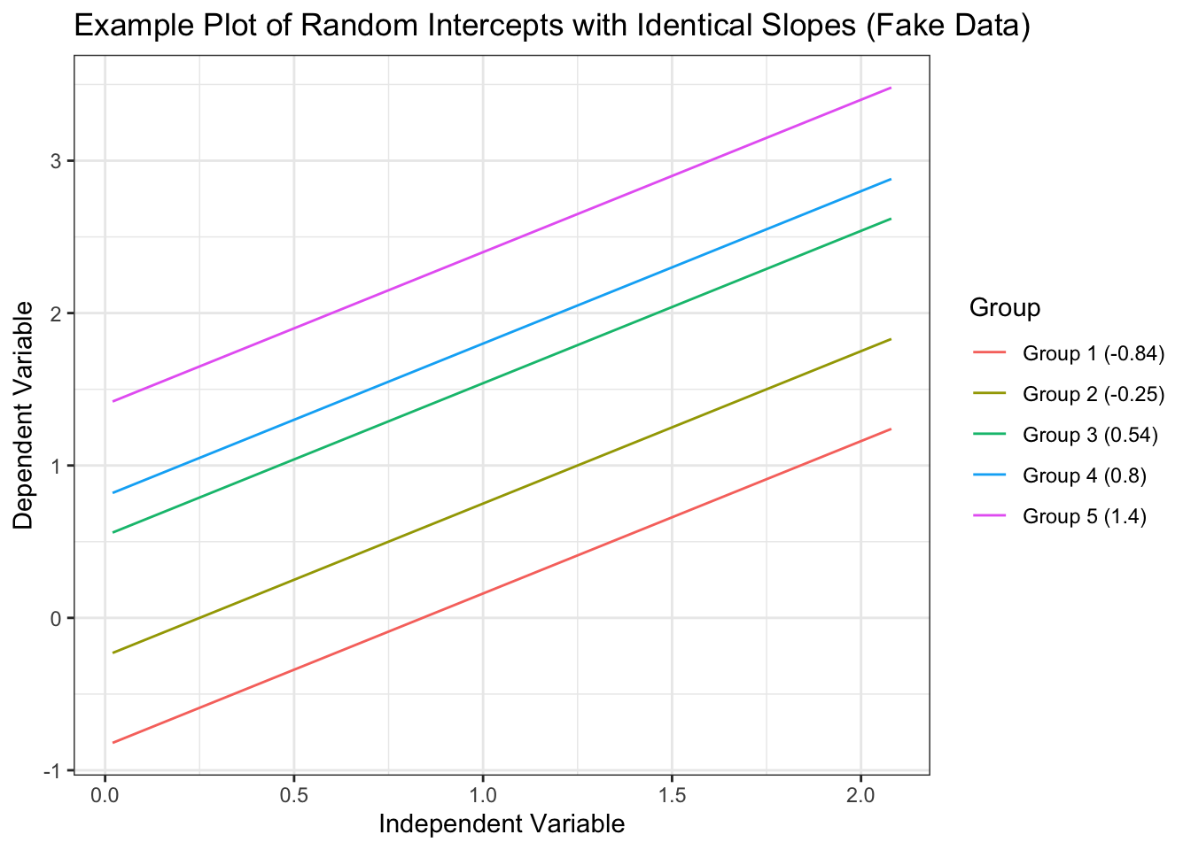
This is nice because any time-invariant effects we are not controlling for in the model are pooled together and controlled for by this county indicator variable. However, you can only estimate within-county effects (how an increase in the yearly prescription rate for a single county effects hospitalizations), not between county effects (how an increase in the overall mean prescription rate of a county effects hospitalizations) as those between county effects are perfectly correlated with the county indicator variable. Random-effects models (aka the mixed effects model, aka the hierarchical linear model, aka the multilevel model, etc.) try to explicitly model the hierarchical differences by allowing estimates for the effect of a variable to vary by group (they are “random” in the sense that each group’s version of the effect varies around an estimated mean effect). The classical example of a random effect in a model is the random intercept, where every group is allowed to have its own intercept (\(\beta_0\) in linear regression). In the context of this data, each county starts out with different numbers of hospitalizations when their independent variables are set to 0. However, the effect of each variable on hospitalizations is set to be constant across counties.
For a significantly more in-depth but still accessible account of these two models, I recommend Bell and Jones, 2015, which helped me tremendously in understanding the underlying concepts of these models in a practical, straightforward way. Due to my desire to estimate the between effects of variables and for reasons outlined in the aforementioned paper, I chose to model prescription opioid hospitalizations with a random-intercept model.
Model Diagnostics
To ensure the legitimacy of the results from this model, we need to check some of its assumptions. Modeling hospitalization counts with a poisson distribution adds an assumption of equidispersion, that the mean and variance of the residuals from our model are the same. More often than not, models suffer from overdispersion. The overdispersion test from the performance package was used to check if the residuals of the model exhibit overdispersion, and the test failed to reject the null hypothesis of equidispersion.
In ordinary linear regression, many checks of assumptions are done by looking at the residuals. However, with a count outcome, the data is often grouped around a few numbers. With the hierarchical structure of our data, this strong grouping only intensifies. This makes it difficult to check classic pearson or deviance residuals and make informed conclusions about patterns in residual plots. However, the R package DHARMa provides a method to check randomized quantile residuals. Randomized quantile residuals are a simulation based approach to checking model validity. Creating these residuals is done by first estimating an empirical cumulative density function (CDF) from the predicted values of the model. Then the actual observational outcome data is checked against the CDF, and the quantile it falls in is recorded. For example, a recorded quantile of 0.75 means that 75% of the predicted data falls below that observation. The “randomized” part of this process is the transformation of an integer outcome into a smooth CDF, which requires adding a random value to the predictions. This is usually chosen from a random uniform distribution. Intuitively, one would think that if the model is guessing wrong in a non-systematic way then the spread of the observations along the quantiles will be pretty even. Indeed, Sadeghpour (2016) showed that if the model accurately reflects the data generating process of the observations, then the randomized quantile residuals will follow a normal distribution.
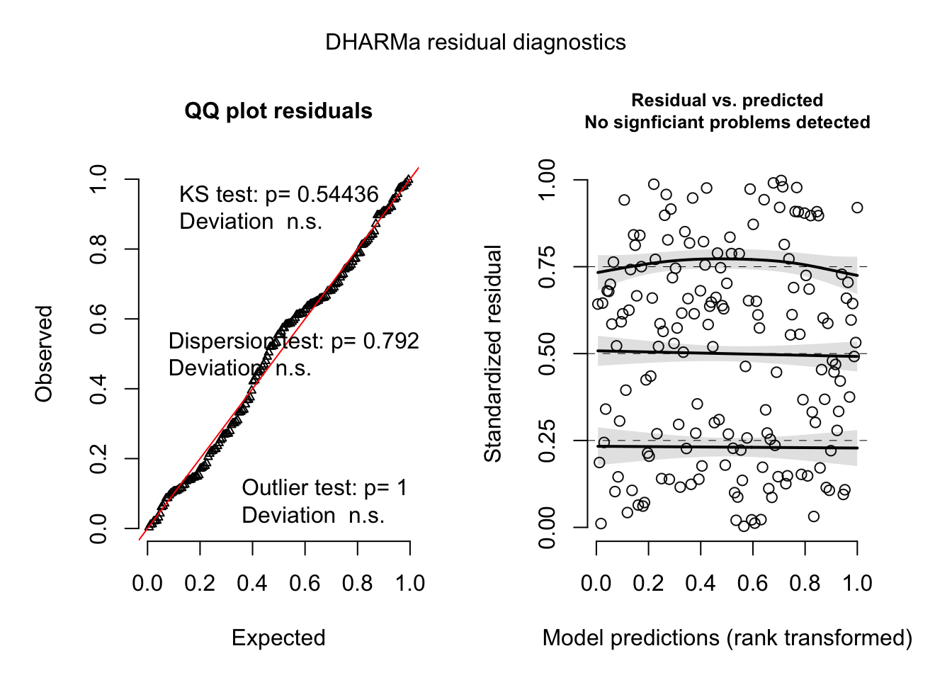
The quantile residuals seem to be normally distributed according to the QQ plot and there is no obvious pattern in the plot of the predicted values and the quantile residuals. The variance of the residuals also stays constant along the range of the model predictions. The black line with the shaded confidence intervals on the Residuals vs. Predicted plot are the results of a quantile regression in DHARMa, showing a comparison of the empirically derived quantiles residuals and the ideal quantile intervals (the default of 0.25, 0.50, and 0.75). The quantile regression is run by regressing the model predictions onto one of the quantiles of the empirically derived residuals. Ideally, one would want to see no relationship between the model predictions and any residual quantile. This is also true of the independent variables. A relationship between an independent variable and a quantile of the residuals could indicate there is an important variable missing from the model or some other misspecification that could mean bias in the estimates.
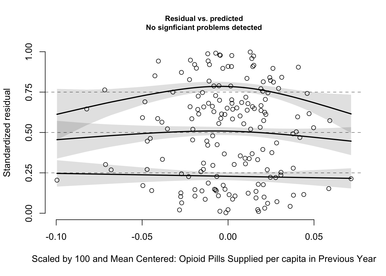
The main variable of interest, lagged opioid pills supplied, does not show any statistically significant quantile deviation. However, there is a quadratic looking pattern. This may indicate that the relationship between opioid supply and hospitalizations could be modeled with a quadratic transformation, or that there is some missing variable(s) accounting for the relationship. I could not get a successful model fit after adding a quadratic opioid supply term, and given the low count of observations, I leave that to future work. If this analysis can be extended to the entire United States, the increased number of observations would allow for more complex relationships to be included in the model.
The underlying data from the dashboard actually comes from the NJ Hospital Discharge Data Collection System (NJDDCS). The NJDDCS collects its data from electronically submitted claims for health care provided in a hospital or electronic submitted exchanges of claims information between payers. Payers in this case being either the individual, business, or insurance company paying for a healthcare service.↩︎
The actual data supporting these maps and tables comes from the IQVIA Xponent 2006–2018 data, a sample of approximately 49,900 retail (non-hospital) pharmacies, which dispense nearly 92% of all retail prescriptions in the United States. From the CDC Website, a prescription in this data is defined as “an initial or refill prescription dispensed at a retail pharmacy in the sample and paid for by commercial insurance, Medicaid, Medicare, cash or its equivalent. This database does not include mail order prescriptions.” Unfortunately, there is no guarantee that the person obtaining a prescription lives in that county, which adds uncertainty to the rate numbers provided by this data.↩︎
A more thorough discussion of choosing ACS estimates can be found in Appendix 1 of University of Michigan’s ACS guidelines.↩︎
The terms fixed effects and random effects have different meanings and interpretations depending on who is using them.↩︎